GE Aviation

Blending physical and digital spaces to spark innovation

Close up image of and interactive wall visual

My Role:

Product Design

Creative Direction

Overview:

2015 – 2016

Aviation Industry

IoT

Web App

Overview

From KY to Shanghai

In 2015, GE Aviation presented Forest Giant, the design agency where I worked, with an ambitious challenge spanning three continents. Their vision was to create a physical and digital collaboration space, enabling engineers and team members to work together in an immersive environment. These innovative spaces were to be built in Shanghai, Austin, TX, and Dubai.

As part of a small design and engineering team, I helped bring this vision to life. Throughout the project, I served as a lead Product Designer, focusing on the interactive wall experience and a suite of user-facing applications. Our mission was to seamlessly blend physical and digital spaces, creating an immersive environment that would spark collaboration and innovation.

Skyline photo of Shanghai

The Shanghai skyline during one of the team's visits. Photo credit: Andrew Cenci

Interactive Wall

Data as art

Data is ever-changing and constantly shaped by human influence. In its raw state, data appears chaotic, but through human interaction, we can uncover patterns and meaning. With the interactive wall experience, I aimed to represent these concepts visually. The result was an immersive installation that invited viewers to bring data to life in an organic and artistic manner.

Conceptual renderings of four interactive wall installations that we would later bring to life

Conceptual renderings of four interactive wall installations that we would later bring to life.

Image of me making a prototype to test the sonar sensors

The wall interactions were powered in part by small sonar sensors. By detecting the presence of people and their proximity to the sensor, we could created an environment that responded to their movements. This was an early prototype I built so we could test our ideas.

Explainer graphic for how the sonar sensors work

Imagine a filled line chart occupying the bottom third of the wall. Each line segment is moving up and down slightly in an organic & soft way so the shape is always changing. The data behaves as if it’s a living, breathing thing.

Image of Ernst Chladni and his Chladni figure drawings

When the user activates the sonar sensors the data visual grows to create a colorful new apex within that sensor’s column. As the data grows, the organic movement becomes a bit more rigid, as if the user is bringing structure to the data. The height of the apex changes based on the user’s proximity to the wall.

Watch one of our early tests within the physical space as we were dialing in the sensor sensitivity.

Image of the interactive wall

A variety of content was ultimately displayed on the interactive wall. Here's one more example.

Ascend Platform

Controlling the space

A large part of this project focused on designing a custom software platform we built to control the immersive and collaboration spaces. The platform, named Ascend, allowed users to customize which apps and tools were connected to each physical space. The apps and tools built on top of the platform enabled users to collaborate in an immersive and impactful way.

UI mockup of the Ascend software platform

At a high-level view, users could see all the areas within the experience and which app each area was paired with. Tapping an area-app tile took the user into the application for that specific area. In addition, the entire experience could be themed to the airline visiting the center.

UI mockup of the Ascend software platform

When the Interactive Visualization app was pared with a space it allowed the user to choose which interactive wall experience to run.

UI mockup of the Ascend software platform

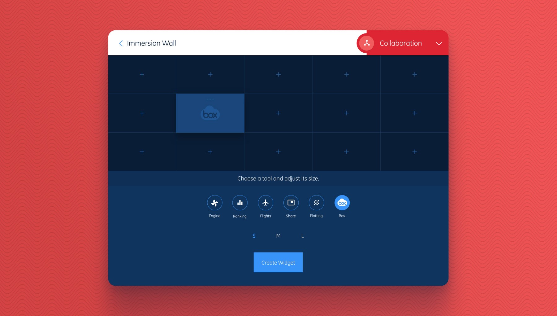
The Collaboration app was the most robust. When connected to a space, it paired with a video wall and allowed teams to collaborate in an immersive way. It included six different collaboration tools. Users picked the tool they wanted, then defined the size and location to be shared on the video wall.

Explainer graphic for how the Collaboration app works

Here's a graphic to explain how it worked at a high level.

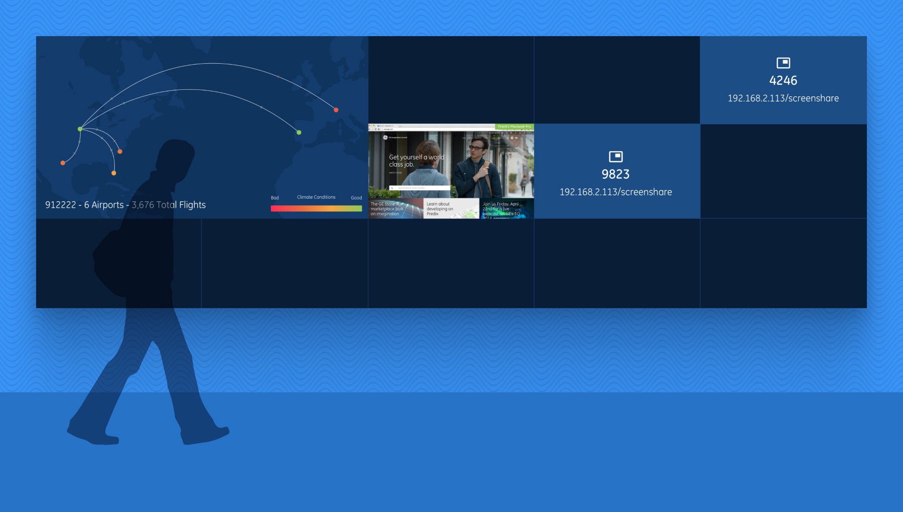
Mockup of the Collaboration app video wall

Here's an example of a few different tools being shared to the video wall.

UI mockup of the Ascend software platform

The Flights tool allowed users to see flight totals, airport locations, and climate conditions for specific engines.

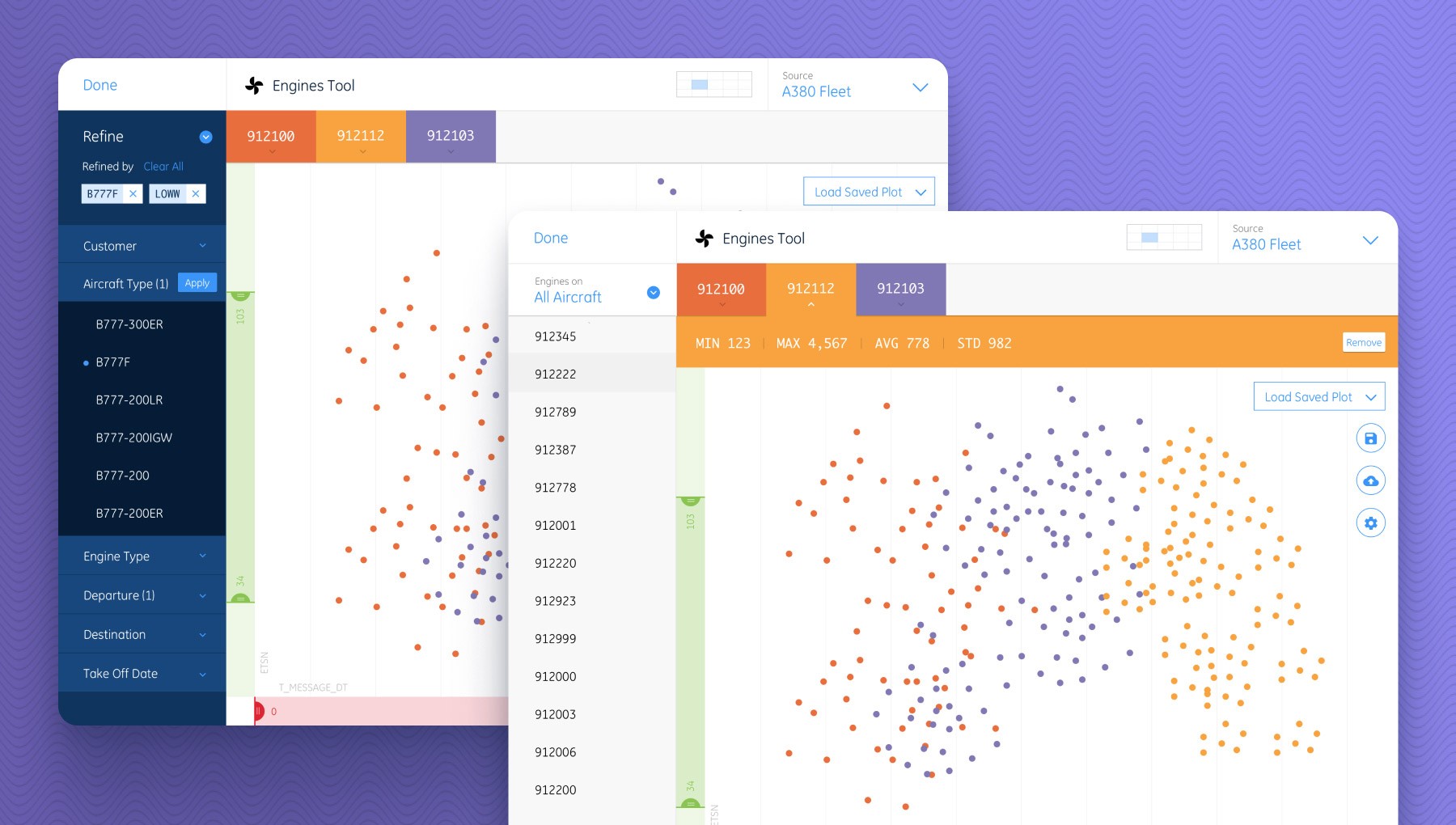
UI mockup of the Ascend software platform

The Engines tool allows users to plot and visualize engine data to help with their analysis.

Image of one of the spaces running the Collaboration app

This is what one of the spaces looked like when running the Collaboration app. Users controlled the space by using the touch table or any connected mobile device.

Conclusion

Seeing it all come together

Watch the show reel. Video credit: Andrew Cenci

Reflecting on this project, I realize just how special that time was. Our small team of artists, designers, and engineers shared a unique creative chemistry, driven by a common goal—to make something truly cool and inspire each other in the process. We were experimenting with cutting-edge technology, constantly pushing the boundaries of what we thought was possible. Did we make things harder on ourselves than necessary? Probably. But that’s the nature of growth and staying inspired.

Robby Davis is an exceptional design partner. We’ve tackled a wide range of complex projects together, from enterprise software to consumer apps, and his unique ability to combine strong visual design with a collaborative approach to UI and information architecture is rare. Robby actively engages with designers, engineers, and cross-functional teams, and his commitment to supporting UX research is invaluable. He has a talent for simplifying complex challenges, making them approachable for both clients and users. His thoughtful, team-oriented mindset makes him a pleasure to work with, and I would eagerly collaborate with him again.

Kevin Morrison

UX Research, Strategy & Design, Forest Giant

If you think there’s an opportunity for me to help you or your team, please get in touch!