My Role:
Brand Identity
Lettering
Creative Direction
Overview:
Overview
Not your cookie-cutter life coaching experience
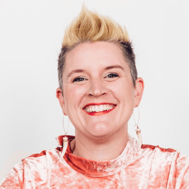
Brianna radiates positivity and energy like few people do, so when she asked me to create a brand identity that captured her vibe it was a no-brainer. She was in the early stages of launching her life coaching practice that aimed to provide an alternative to the cookie-cutter approach. She would embody a blend of toughness and grace, grit and polish—qualities that echo her Detroit automotive roots. Together, we set out to build a brand identity that would capture her one-of-a-kind spirit and vision.
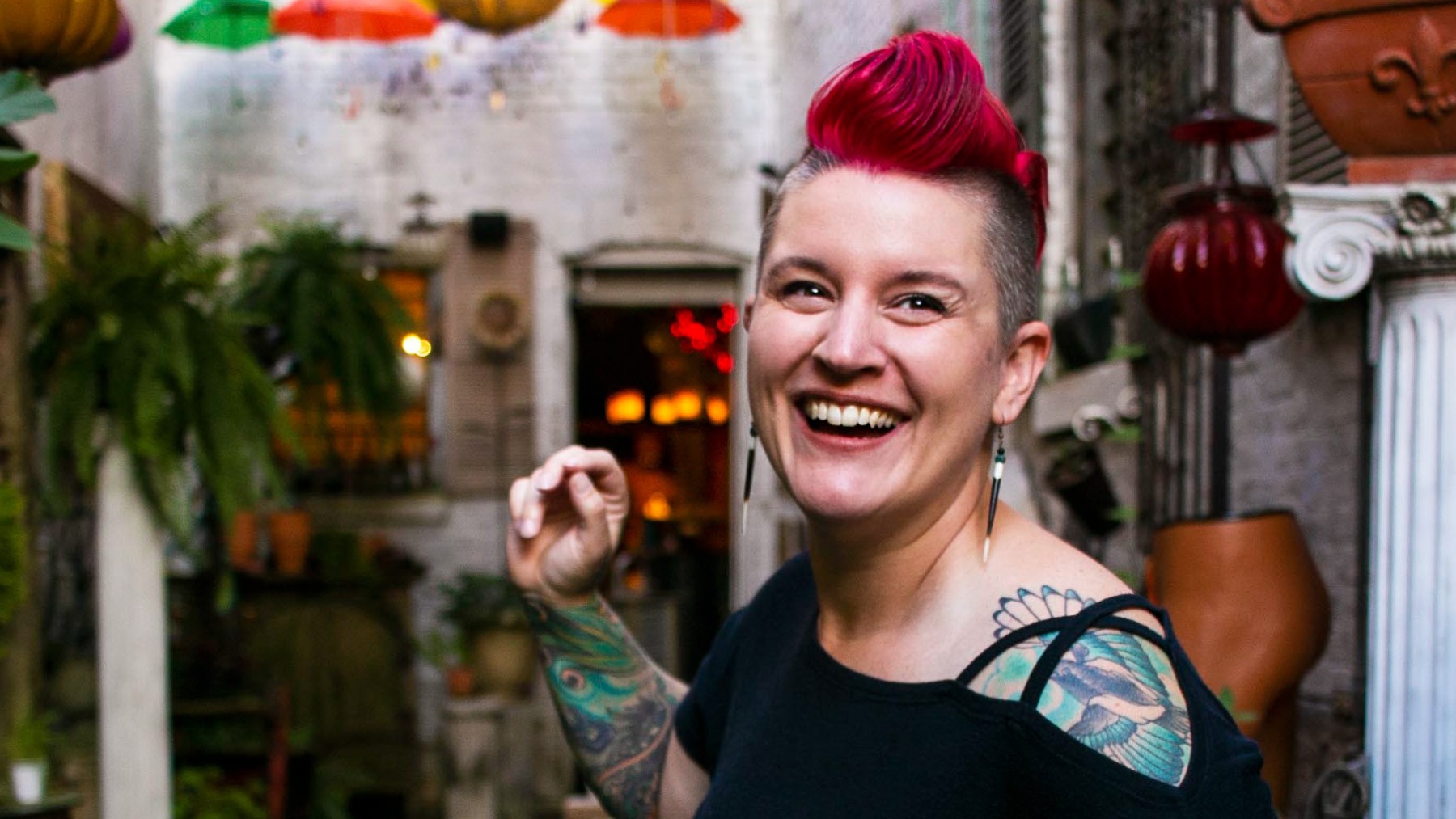
This photo of Brianna captures it all—vibrant energy, positivity, and unique style. Our goal was to craft a brand identity that blended these qualities with the spirit of muscle car culture.
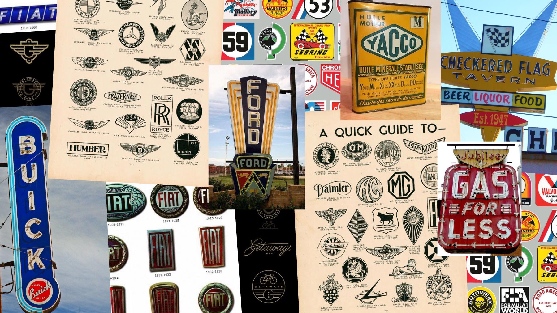
We started by looking to the past, drawing inspiration from classic automotive emblems and vintage signage.
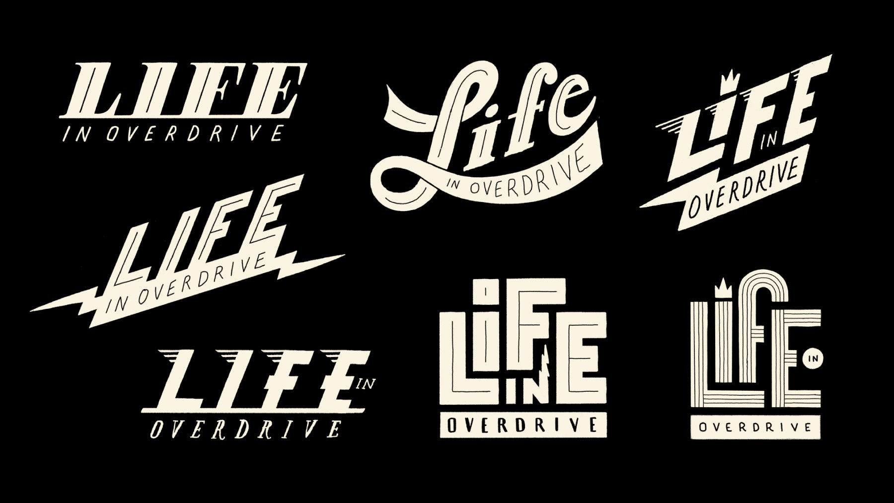
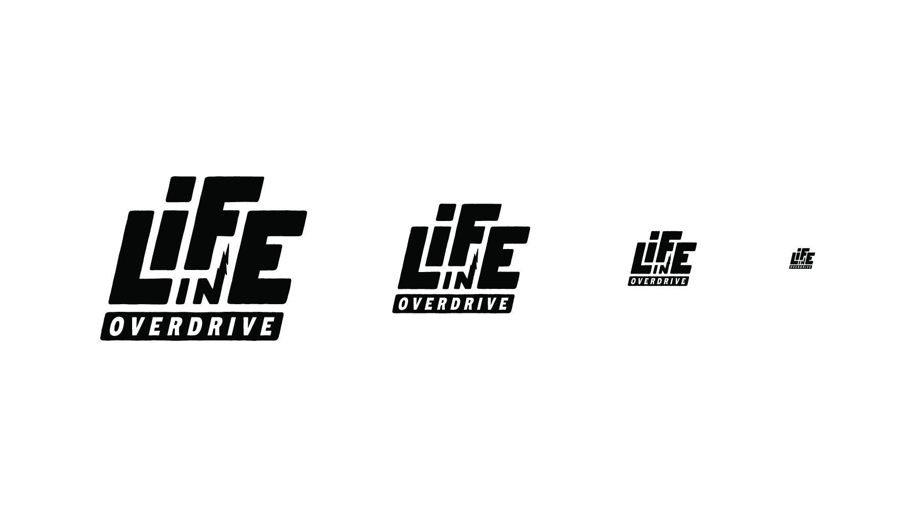
During the conceptual phase I explored several design directions for the logo.
"I've tried to capture a certain blue-collar aesthetic with hints of grit, grime, and classic automotive culture. The marks are not delicate. They each have backbone and are not afraid to get dirty by putting in the hard work. They have a certain hand-machined quality to them with an attention to detail that's not prissy and perfect. They're built on a solid foundation and have a sense of forward momentum - always excited to see what's around the next turn.
Life is a lot like a classic car - you've gotta take pride in your ride and not shy away from the required maintenance."
A quote from my original logo concept presentation that helps illustrate the vibe we were going for.
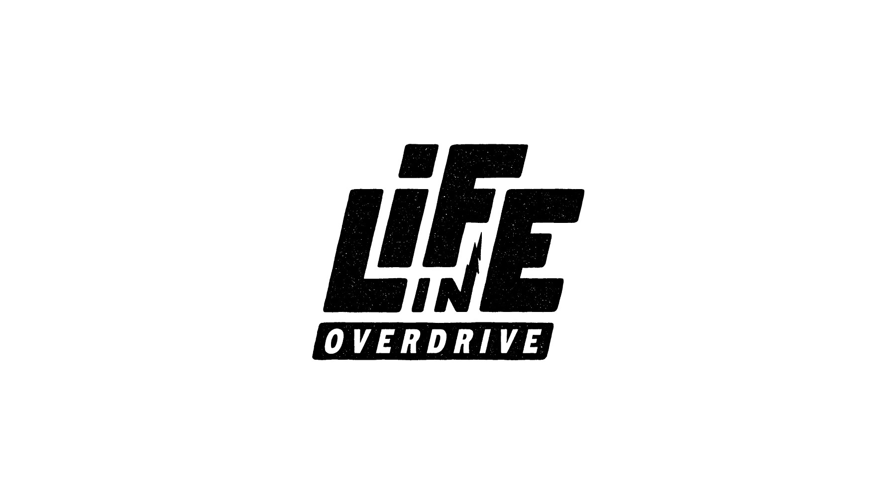
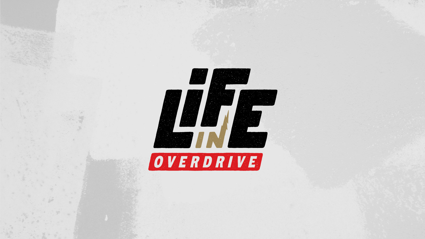
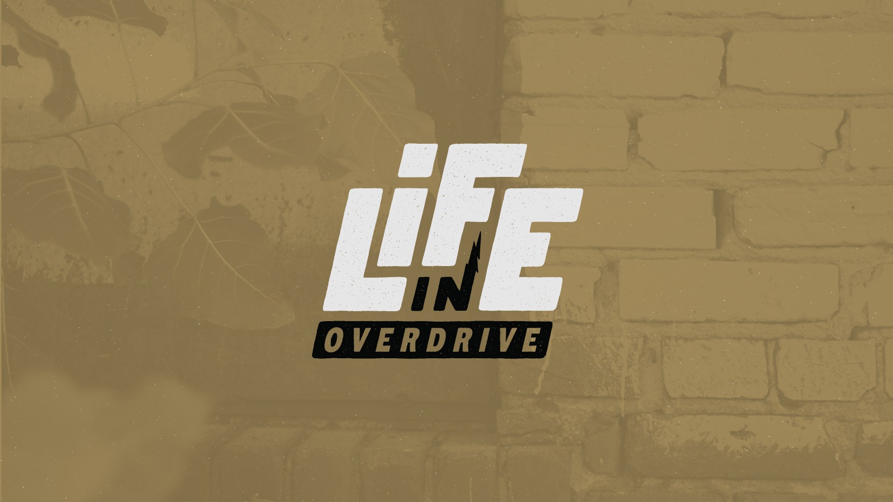
We honed in on the direction Brianna liked best, continued to refine, and ultimately landed on this mark for the logo.
Part of this effort included defining logo usage guidelines for things like sizing…
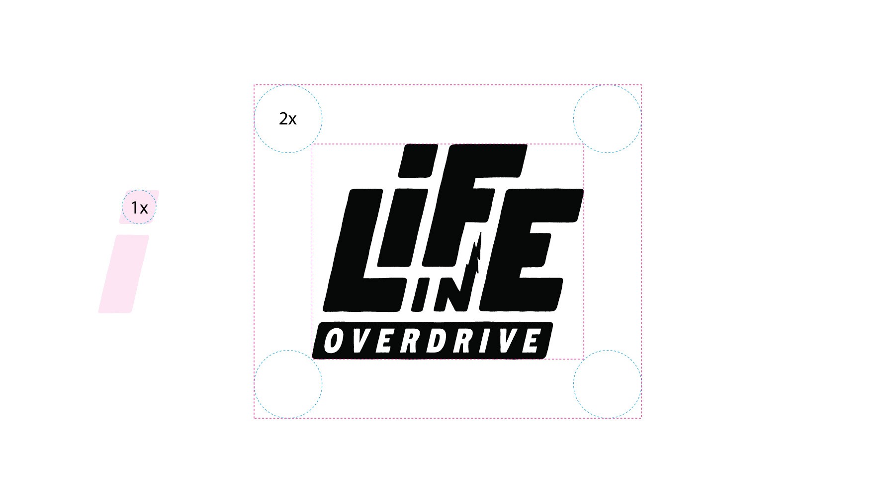
…and spacing.

Next, we started to explore color palettes. After several iterations, we landed on a palette with strong vintage muscle car vibes.
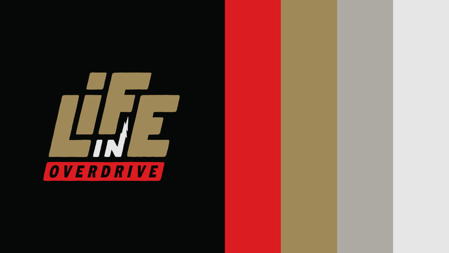
The final mark in various colorways.
Elements of urban texture also played a large role in capturing the brand personality we were going for.
Another example of a photographic background texture.
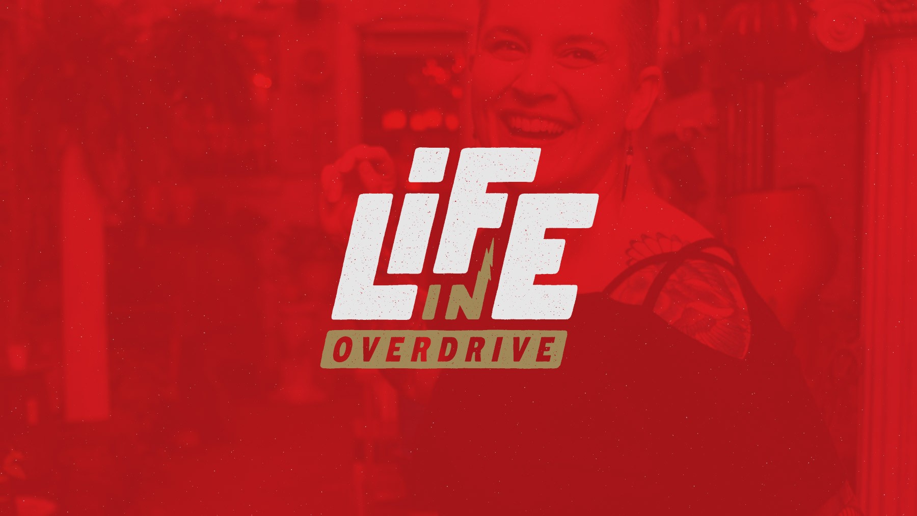
An example of pairing textures with lifestyle photography.
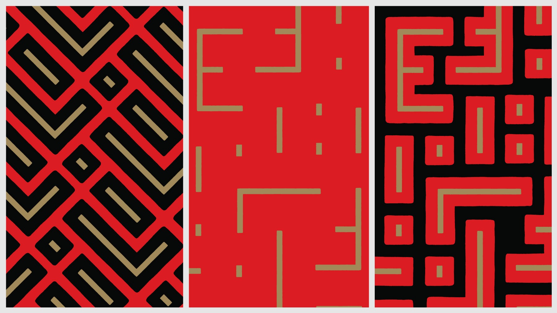
Pattern exploration using elements of the logo. These were intended to abstractly represent elements from automotive culture (i.e., racing stripes) and one's personal journey to navigate a path to a better life (i.e., urban street view and a maze-like pattern).
If you need help establishing a brand identity for your business, please get in touch!