Resound – The AI Podcast Editor for Creators

How I helped an AI startup establish a unique brand and build a product

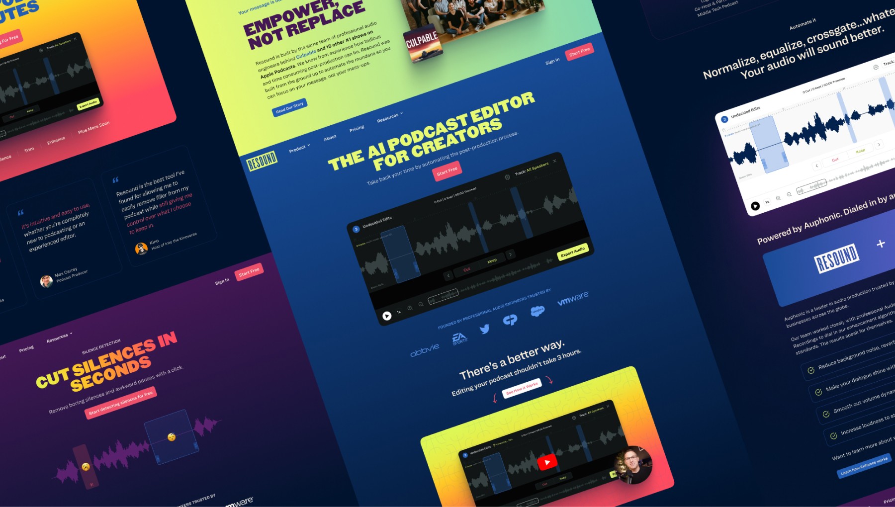
Resound brand gradient background
Resound user interface image
Resound brand gradient background
Resound user interface image
Resound brand gradient background
Resound user interface image
Resound brand gradient background
Resound user interface image

My Role:

Brand Identity

User Research

Product Design

Creative Direction

Illustration

Overview:

2022 – 2024

Podcast Industry

B2C SaaS

Web App

Meet the Client

Bootstrapping a successful podcast agency and finding a key problem

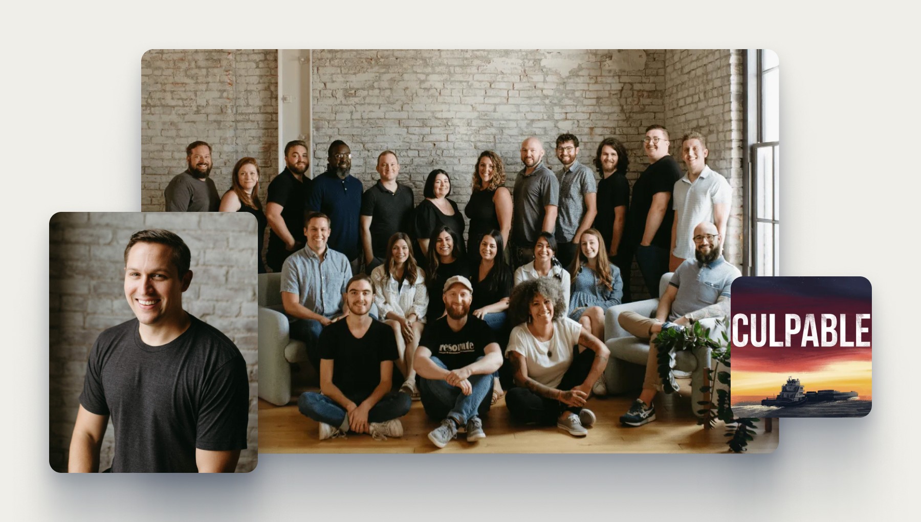
Image of Jacob Bozarth and the Resonate Recordings team

Jacob Bozarth and the Resonate Recordings team.

Meet Jacob. He’s the founder of Resonate Recordings – a podcast production agency in Louisville, KY. He and his team have worked on 15 #1 Apple Podcasts, served clients like Honda, Salesforce, and Twitter, and created the original True Crime show – Culpable.

Despite all of these successes, there was always a problem. Editing podcasts was tedious work and efficiency is everything in an agency. To make their lives easier they began training a machine-learning model to catch repetitive edits. As the model became more accurate they realized there was an opportunity to share it with others. The seed had been planted for Resound.

Robby has done design, branding and UX for two companies I have started. The level of thoughtfulness, quality, and creativity he provides is truly a rare find. After working with Robby, we have gotten hundreds of compliments from investors, partners and customers. Recently, Robby designed a pitch deck that helped us raise over $1.8m in funding. I had investors saying it was the best-looking deck they had ever seen.

Jacob Bozarth

Founder & CEO, Resound.fm

Understanding the Opportunity

Creating a podcast should be as easy as creating a TikTok

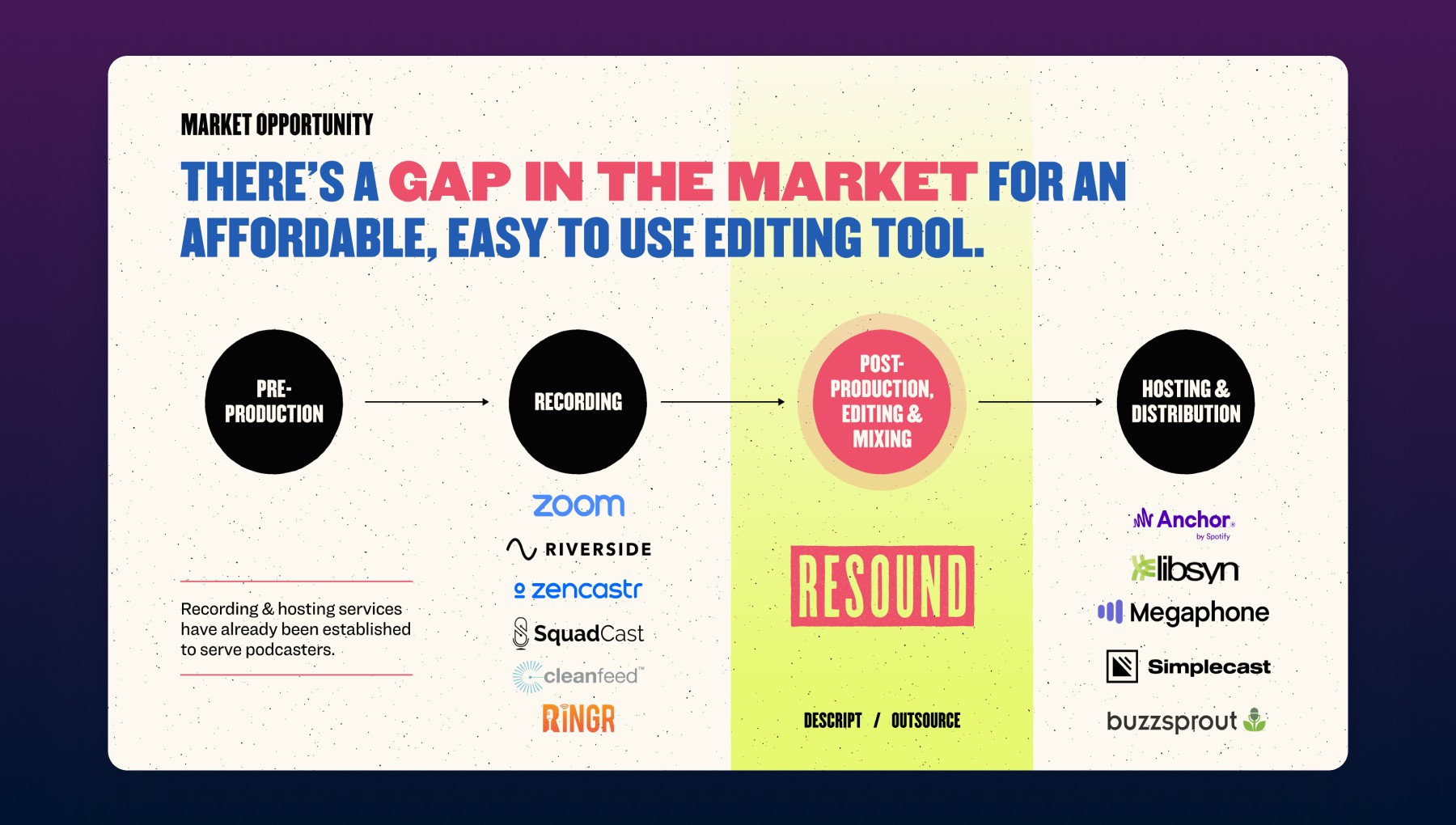
Podcasts have grown 700% since 2018, yet 44% of creators stop after the first 3 episodes.

Image of the pitch deck slide highlighting the market opportunity

A slide from our initial pitch deck.

What if AI could act as an “Audio Engineer Assistant” doing most of the work for you? That’s what we set our sights on – How might we automate podcast editing with AI?

To start answering this question we dove head first into customer research. We interviewed Audio Engineers, Producers, and others in the podcasting industry to better understand how they worked and what pain points they felt along the way.

As the problems we were trying to solve began to take shape, a decision was made to split away from Resonate Recordings and start a new company called Resound. It would focus solely on building an AI podcast editor for creators and target a younger, DIY demographic. We needed to create a new brand – quickly!

Brand Identity

Crafting a modern brand by looking back 250 years

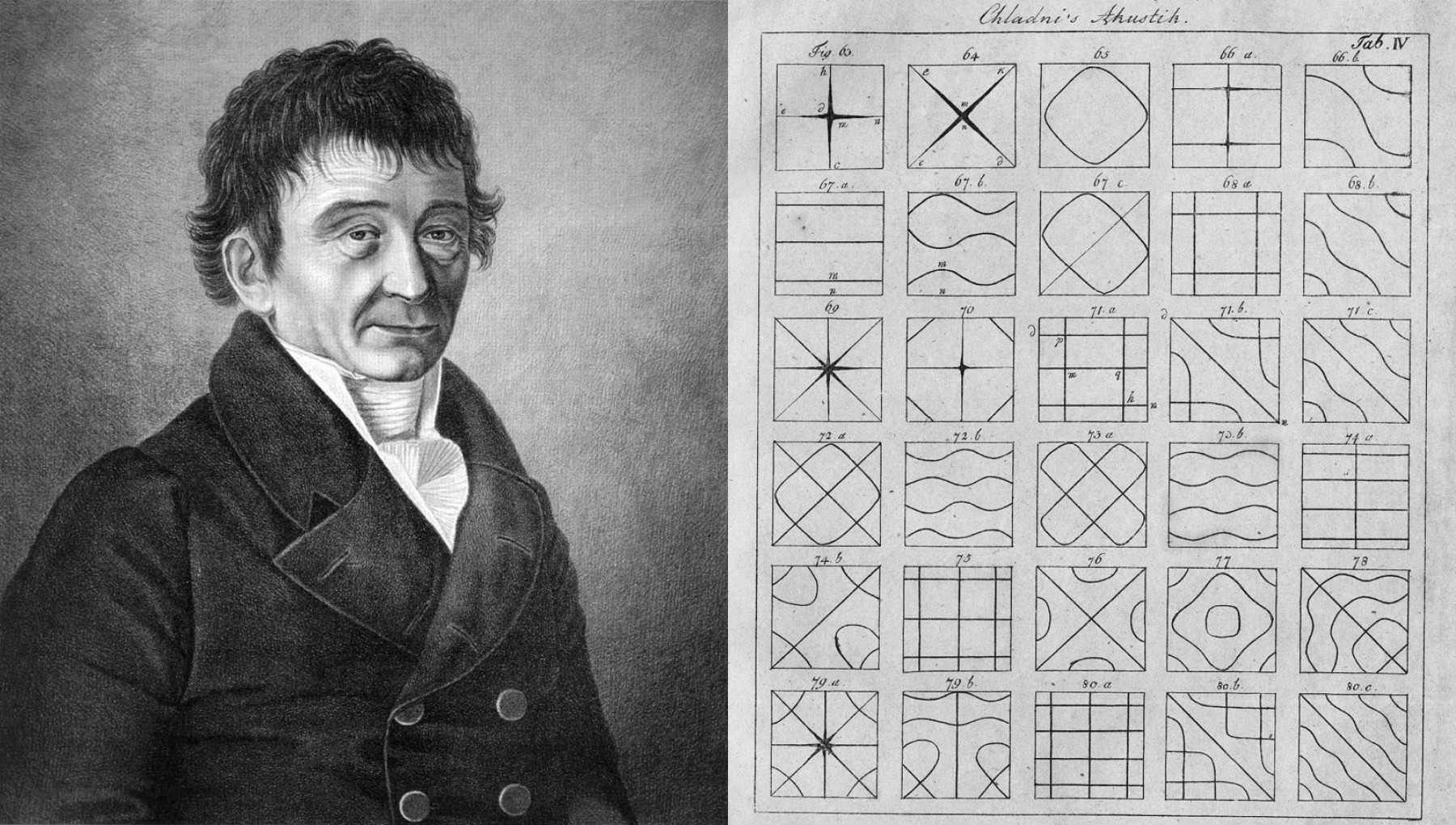
Image of Ernst Chladni and his Chladni figure drawings

Ernst Chladni, German Physicist & Musician (1756-1827), shown next to his Chladni figures

Meet the Father of Acoustics, Ernst Chladni

One of Chladni's best-known achievements was inventing a technique to visualize vibration frequencies on a rigid surface, known as Chladni figures.

Watch how Chladni figures are formed

Chladni Figures were the perfect nugget of inspiration to build on.

They visually combine art and science, aligning well with what Resound ultimately was – a platform rooted in logic, math, and technology providing creators the tools and features to express what makes them unique. Their voice.

I followed this rabbit hole and things began to take shape. The result was a visual brand identity that stood out within the space and would appeal to our Gen Z target audience.

I've worked with Robby for 5+ years now, and I can honestly say he's been an incredible design partner. He approaches work as an artist without an ego and with a hunger to keep honing the craft. 12/10 stars in terms of quality of work, communication, consistency, and speed! Be warned: After working with him for a few months your own taste in design and aesthetics is guaranteed to go up. Work with Robby! 

Colby S.

Product Manager, Resound.fm

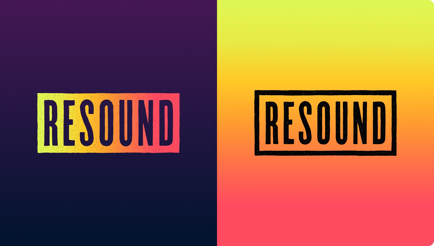
Image of the primary Resound logo

Primary logo

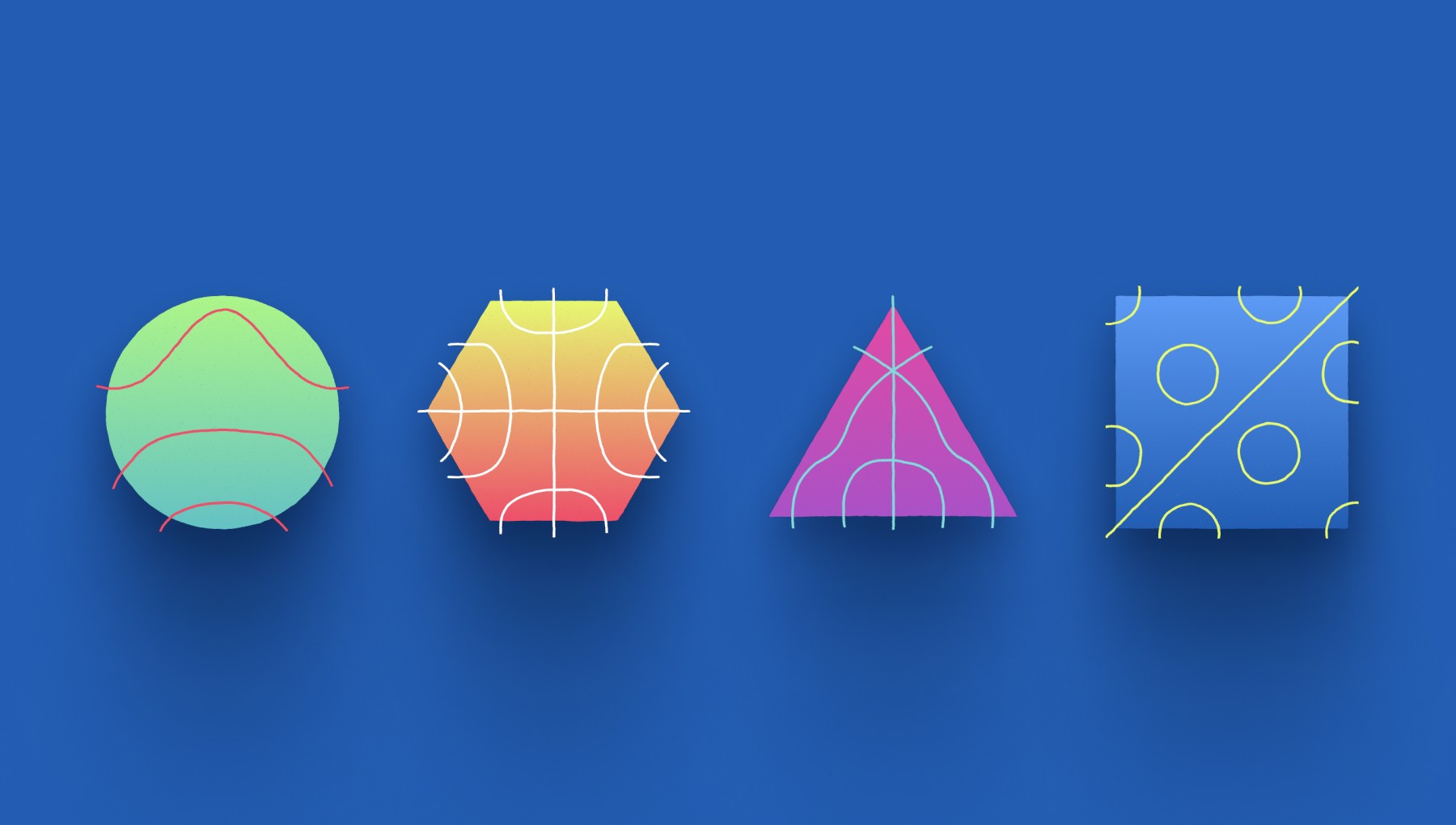
Image of Chladni shapes & patterns

Chladni shapes & patterns

Image of the typogrphy used

Typography

Image of the brand color palette

Brand palette

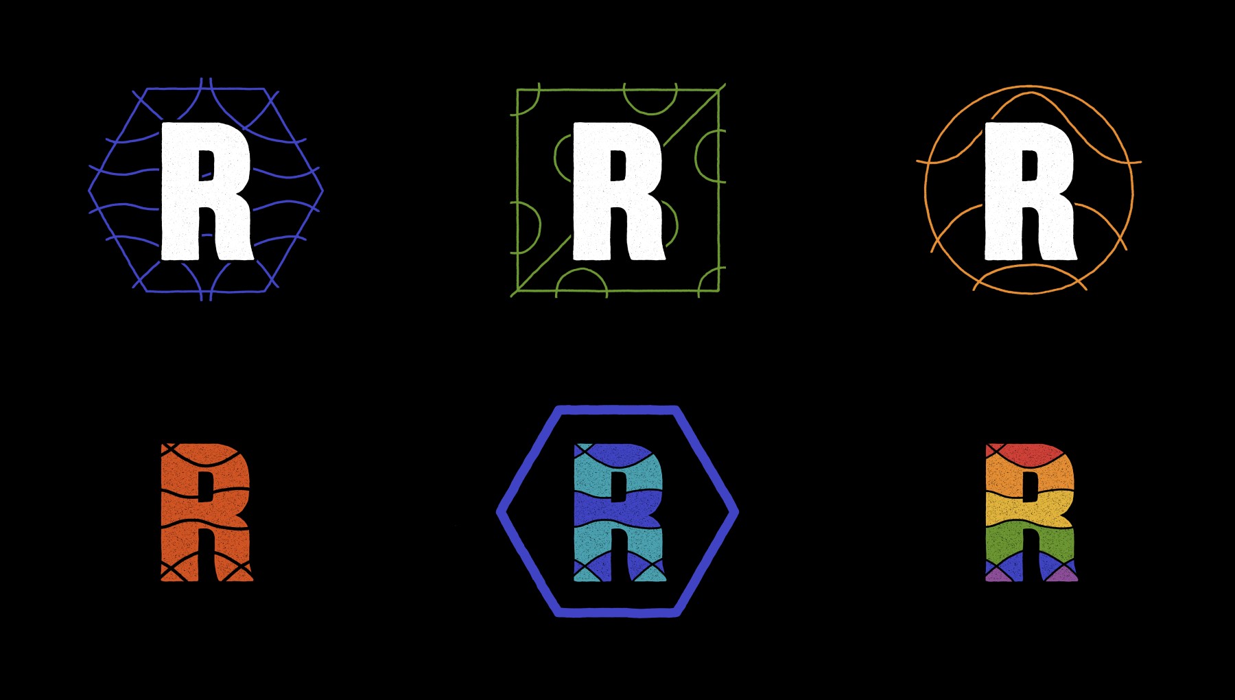
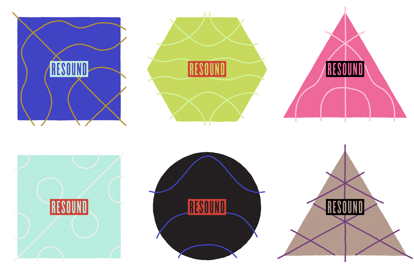
Image of Resound monogram treatments

Monogram treatments

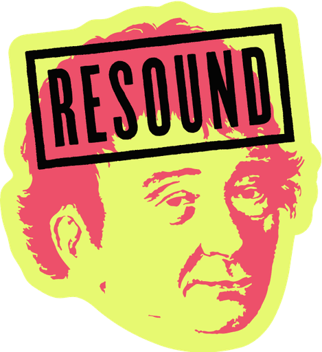
Image of the Chladni head mascot

Chladni head mascot

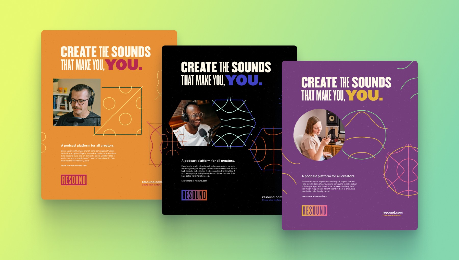
Image of a Resound print ad campaign concept

Initial ideas around a possible “Creator-themed” campaign. Every person has a unique sound. It’s time to be heard.

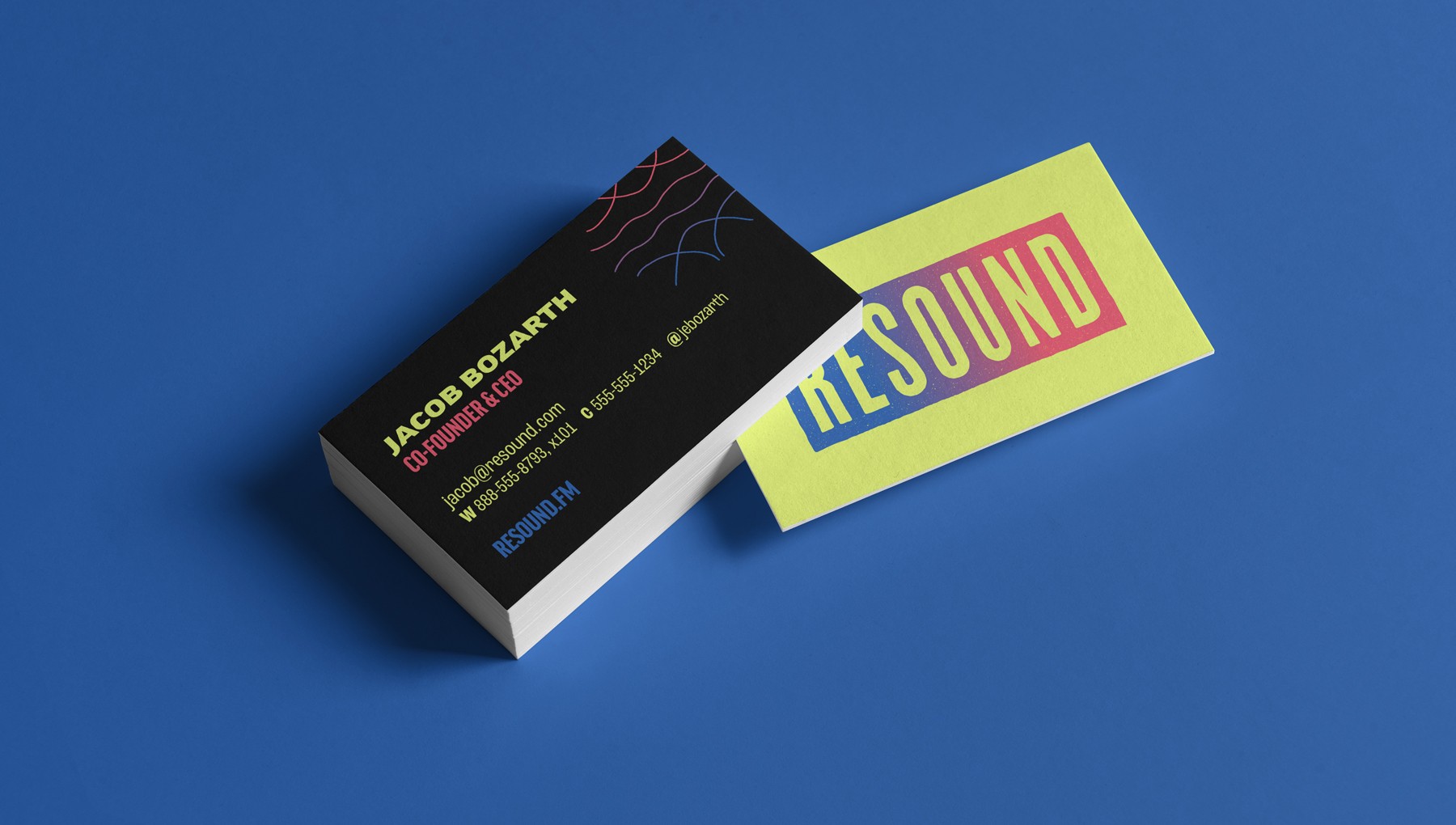
Image of Resound business cards

Business cards

Animated gif of Chladni pattern combination examples

Chladni pattern combination examples

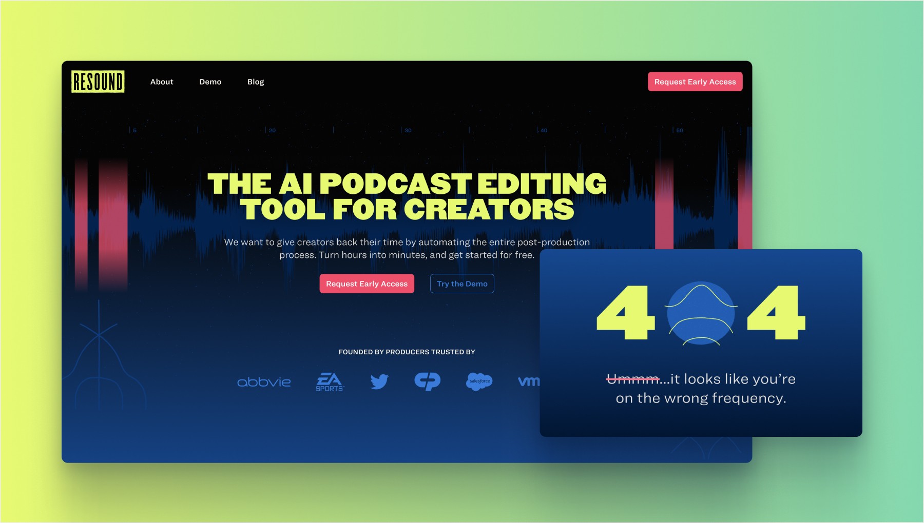
Image of Resound v1.0 website design

The v1.0 website launch was centered around a waitlist signup and demo users could try

Now that we had a solid brand foundation and website in place, we shifted our focus to build an early app prototype and craft our pitch to investors. It was time to raise funds and staff up!

Raising Funds

Designing an award-winning pitch deck

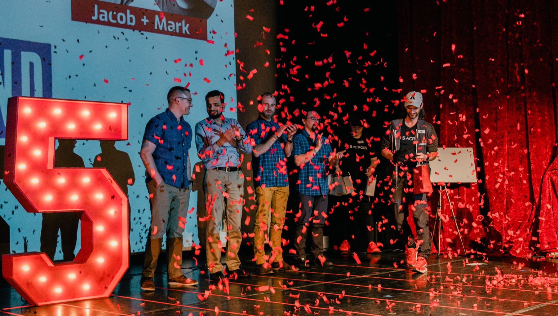
From black and white to high-fidelity. I worked closely with the Founder and Product Manager to design a pitch deck that received a lot of positive attention. It didn’t take long to find partners and investors who were eager to help us achieve our goals. We even took 1st place in Kentucky’s Five Across pitch event! We were ready to go all-in building the product.

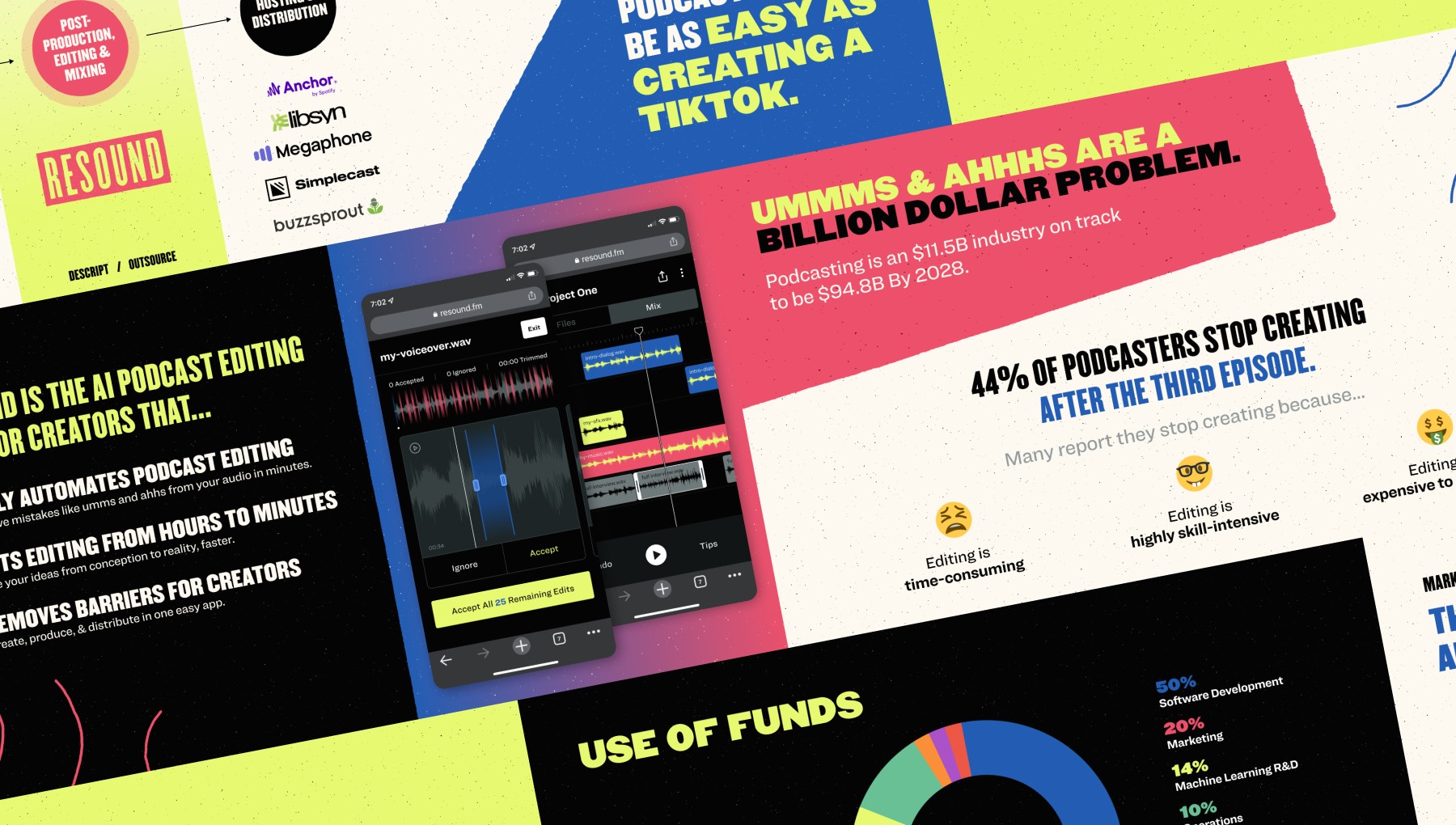
Image of slides from the Resound pitch deck

The pitch deck featured early mobile designs that were later scrapped

Image of Resound's CEO taking 1st place at Kentucky's Five Across Pitch event

Resound’s CEO taking 1st place at Kentucky’s Five Across Pitch Event

Beta Launch

Learning to launch then launching to learn

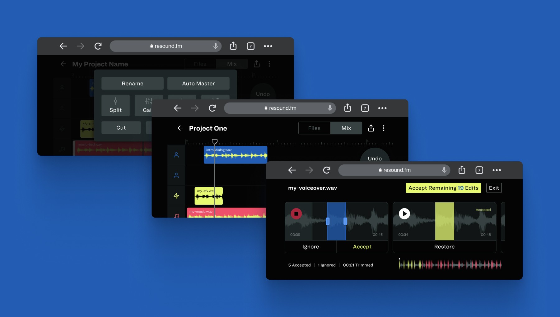
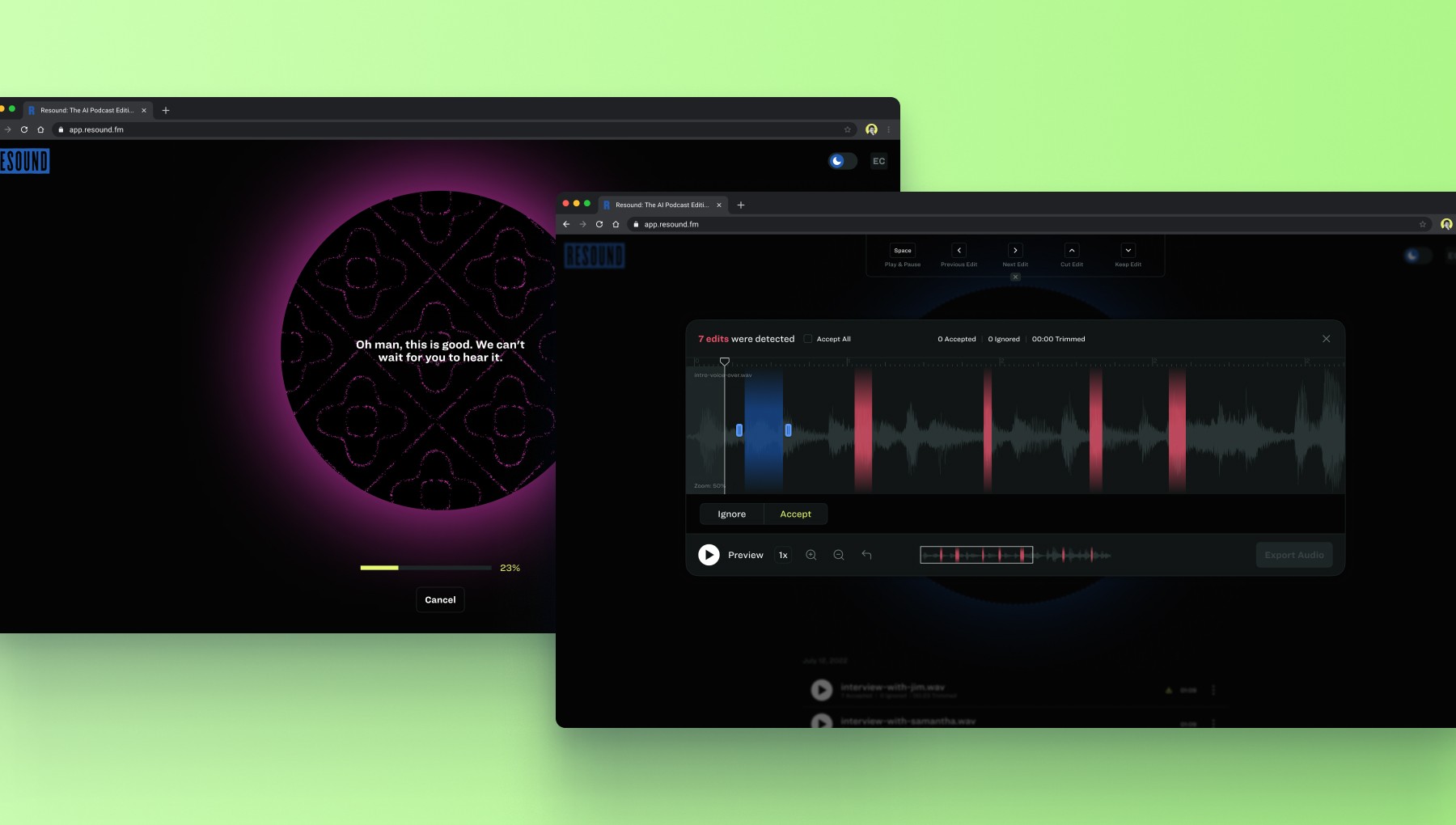
Most of 2022 was spent in research, talking to podcasters, iterating on designs, setting up infrastructure, and training our first machine-learning model at Resound. The result of all this work was a proof-of-concept demo that let you upload a file and see how many edits were detected, with the option to “accept” or “ignore” each edit.

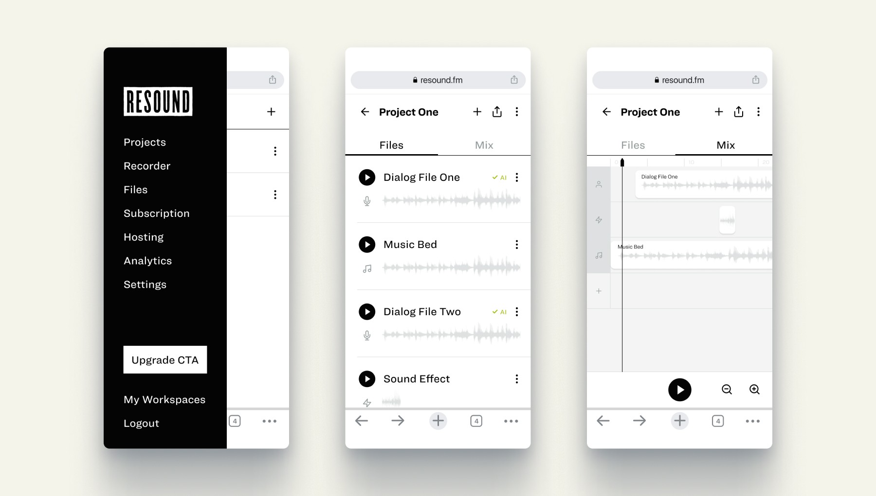
Image of early wireframes for a mobile-first creator app

Early wireframes for a mobile-first creator app.

Image of early design exploration for a mobile-first creator app

Early design exploration for a mobile-first creator app.

Image of beta launch designs after we pivoted to a desktop experience

Beta launch designs after we pivoted to a desktop experience.

Later that year we launched Resound to a private waitlist of 250 people. We started gathering more feedback, hosting discovery calls with users, and learning how we could improve. Our mindset was to fail early and learn fast.

v1.0 Launch

Maturing the product and the way we worked

With a full team in place, things began moving fast. We tightened up the way we worked using common agile methods and organized our roadmap and features in Linear and Notion. Meanwhile, we were still collecting qualitative and quantitative data through analytics, surveys, and discovery calls with users. We shipped a lot of new features as part of v1.0, but these were some notable ones.

  • Figma design system

  • Figma design system

  • Figma design system

  • Figma design system

  • Freemium pricing model

  • Freemium pricing model

  • Freemium pricing model

  • Freemium pricing model

  • Robust lifecycle emails

  • Robust lifecycle emails

  • Robust lifecycle emails

  • Robust lifecycle emails

  • Account creation & onboarding

  • Account creation & onboarding

  • Account creation & onboarding

  • Account creation & onboarding

  • Website, blog & social media

  • Website, blog & social media

  • Website, blog & social media

  • Website, blog & social media

  • Machine learning models

  • Machine learning models

  • Machine learning models

  • Machine learning models

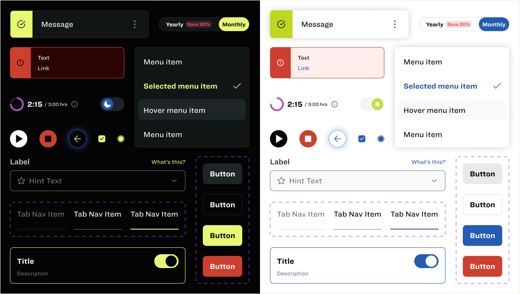
Image of component designs from Resound's design system

Our design system enabled us to work faster and more consistently while creating a shared language between product, design, and dev.

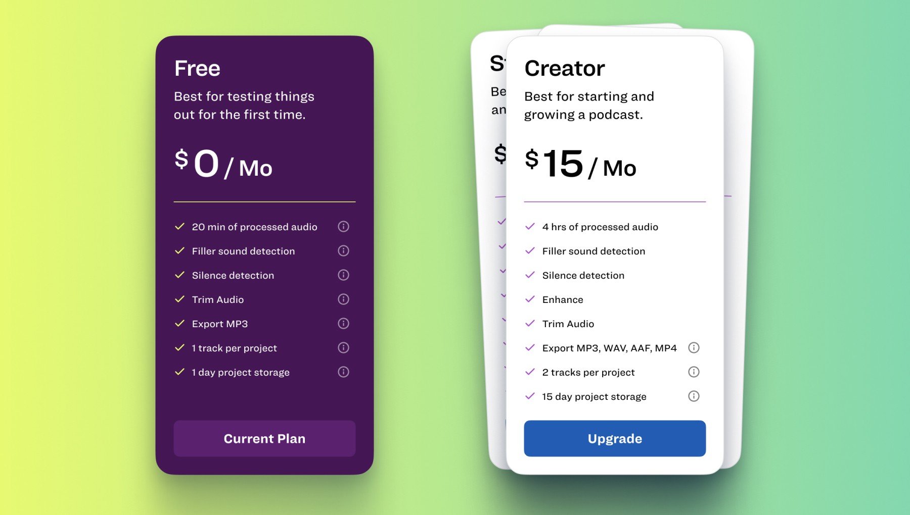
Image of Freemium model pricing card designs

We rolled out subscription plans and went with a Freemium model to start – offering three upgrade tiers.

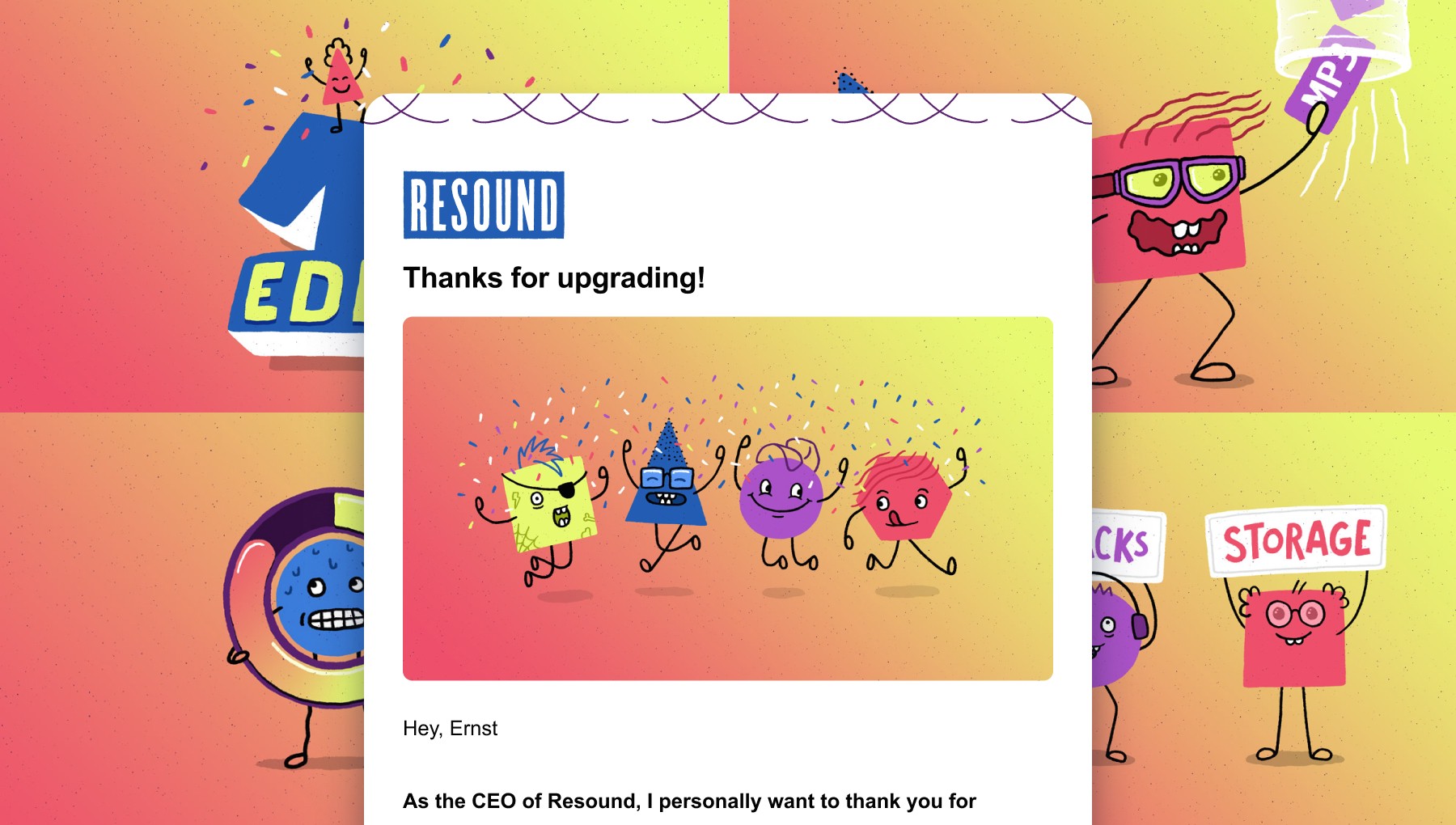
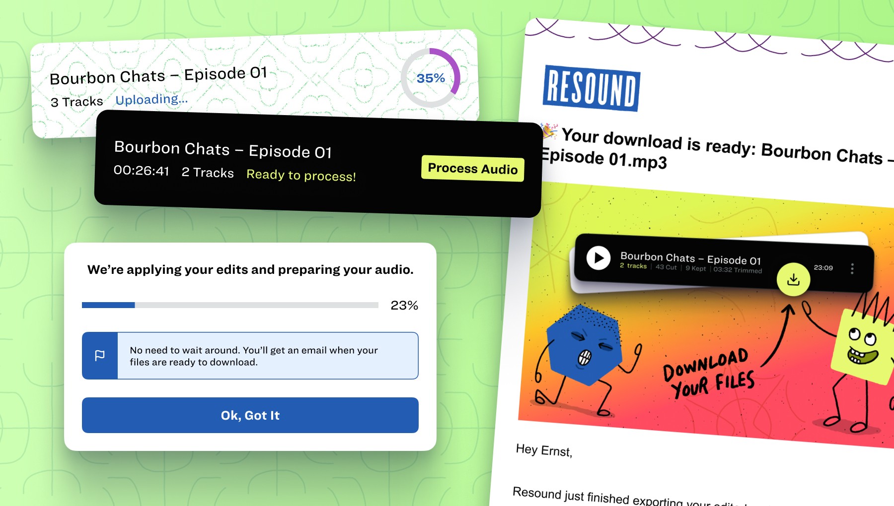
Image of robust lifecycle emails

Our robust lifecycle emails were brought to life by introducing a new visual brand element – “The Chladni Characters”. These characters were used in key moments throughout the user journey to add delight, communicate concepts, and increase brand awareness.

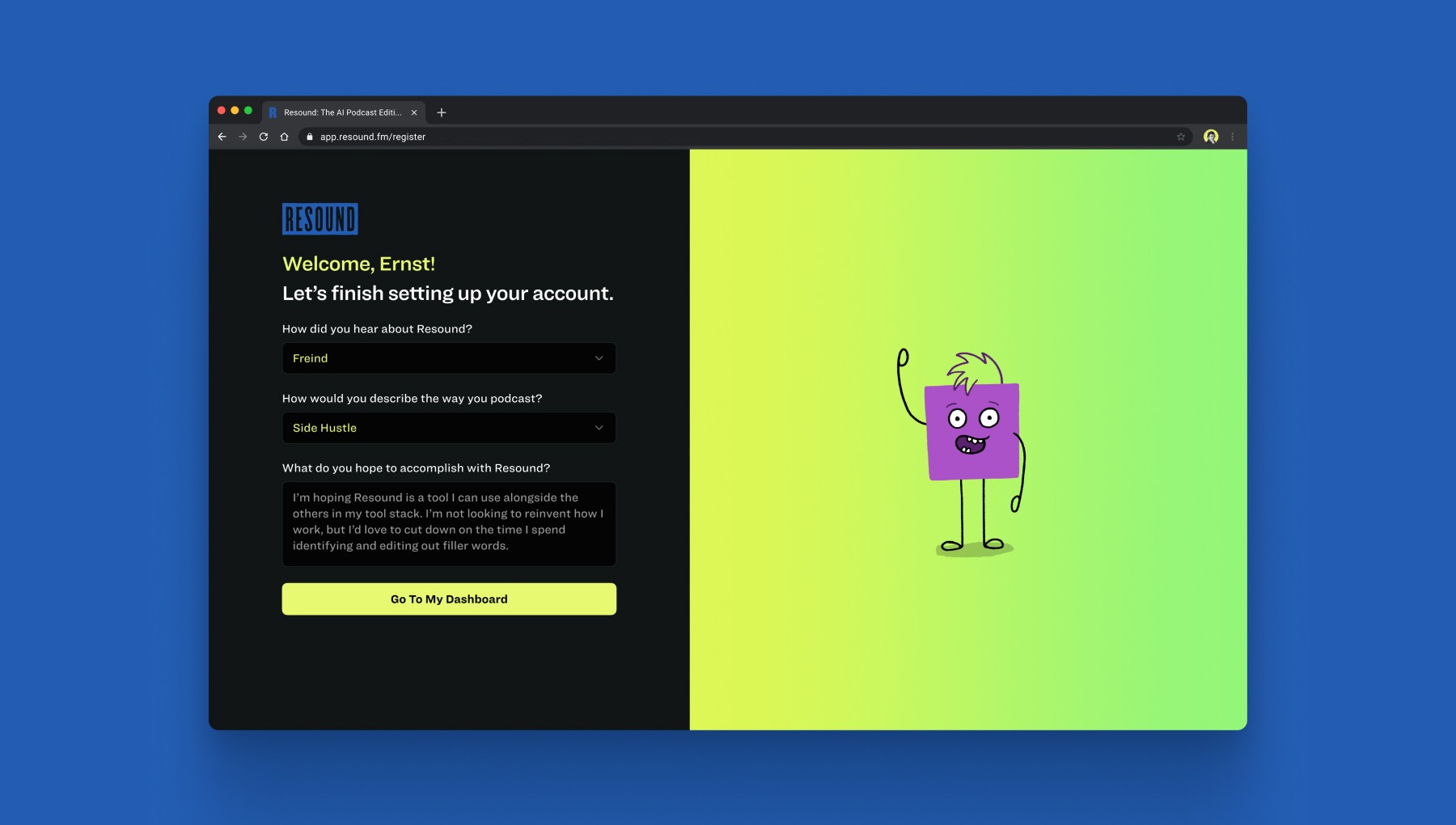
Image of account creation and onboarding process

We designed a 2-step account creation and onboarding process. Our goal was to strike a balance between added user friction and capturing helpful information about our user base.

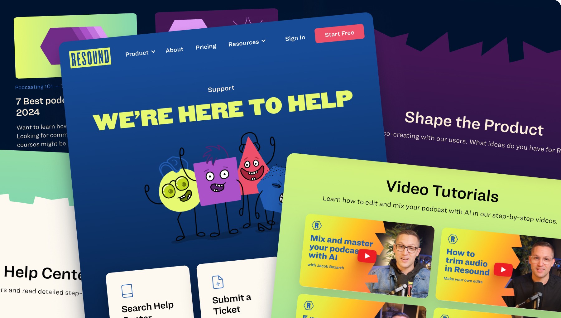
Image of marketing website designs

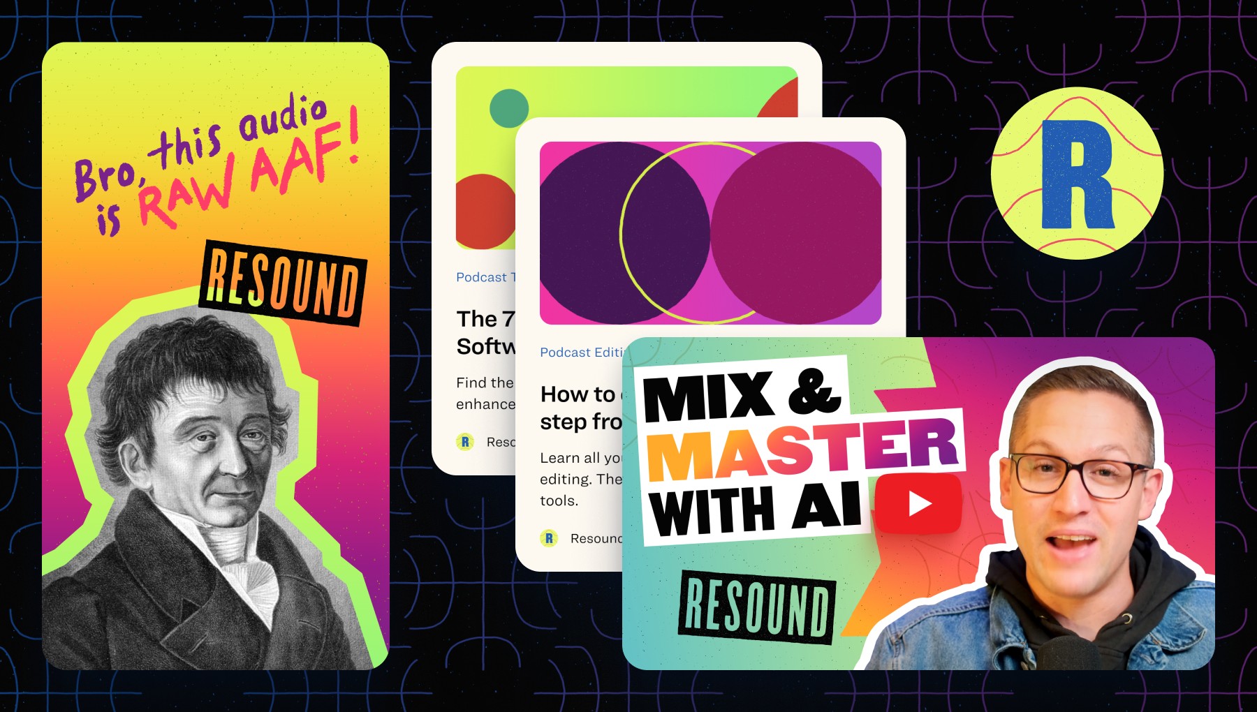
We continued to mature and test our marketing website – adding dedicated feature pages, videos, animation, social proof, partnerships, etc.

Image of content creation designs

We doubled down on content creation to build our brand presence, help with SEO, and be seen as a thought leader in the industry.

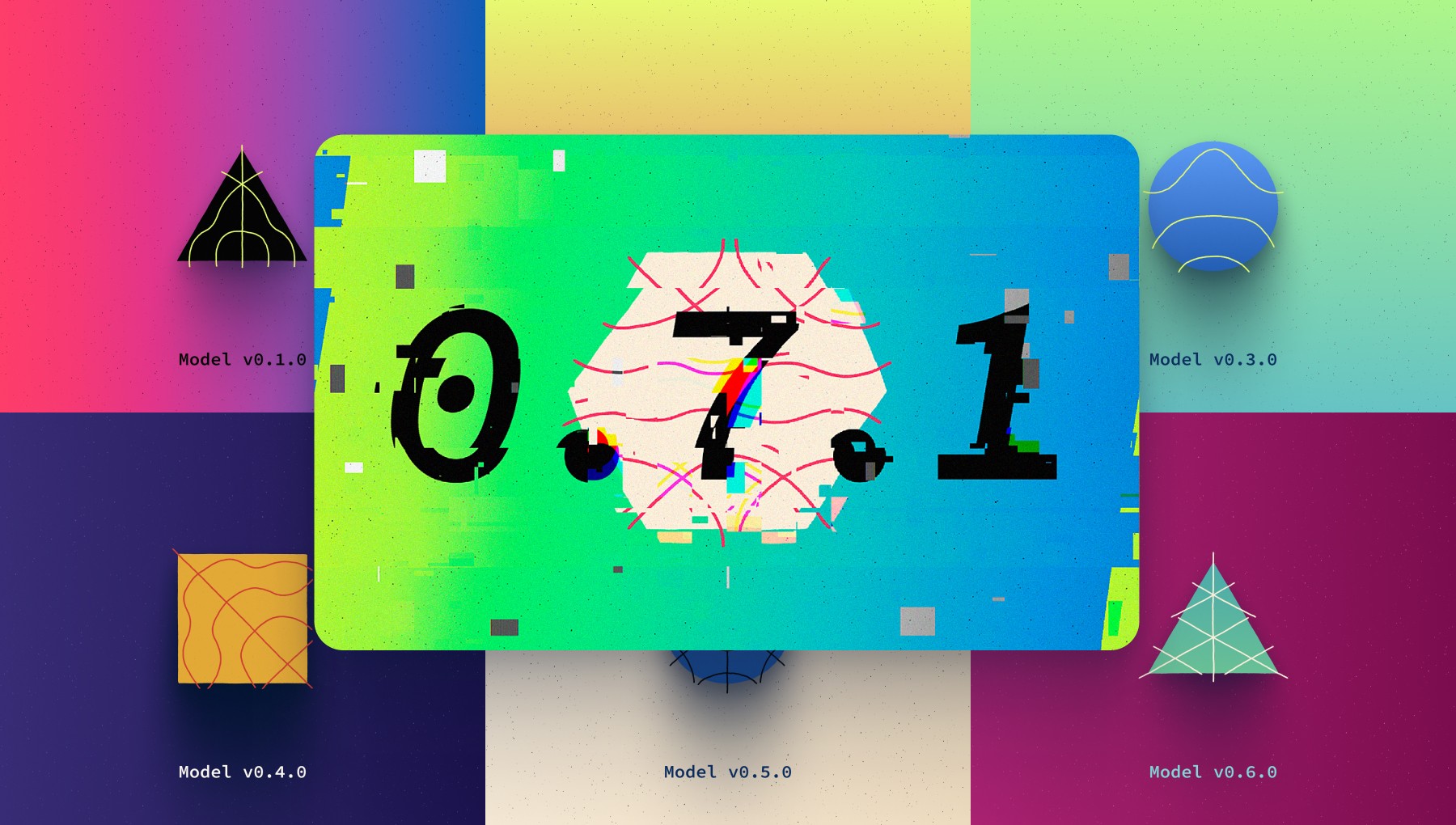
Image of machine learning model releases

We consistently shipped new versions of our machine learning model as it became more accurate – with an over 90% user acceptance rate!

Continuous Improvements

Reducing churn and increasing activation with a few helpful nudges

As our signups began to grow we continued adding features, maturing the marketing website, and making optimizations based on user feedback. However, we noticed we weren’t retaining users at the rate we hoped for. We also saw issues with users starting a project, but not finishing.

We iterated and tested various techniques to improve these KPIs, but we found that two key things made the most impact:

  1. We reduced churn by over 10% by continuously launching new tools our users wanted – Enhance, Silence Detection, and Trim.

  1. We increased the activation rate by over 20% by optimizing the user flow around the job-to-be-done and using product psychology techniques to help nudge users along.

Watch the Product Release video to see the new features we added that helped reduce churn.

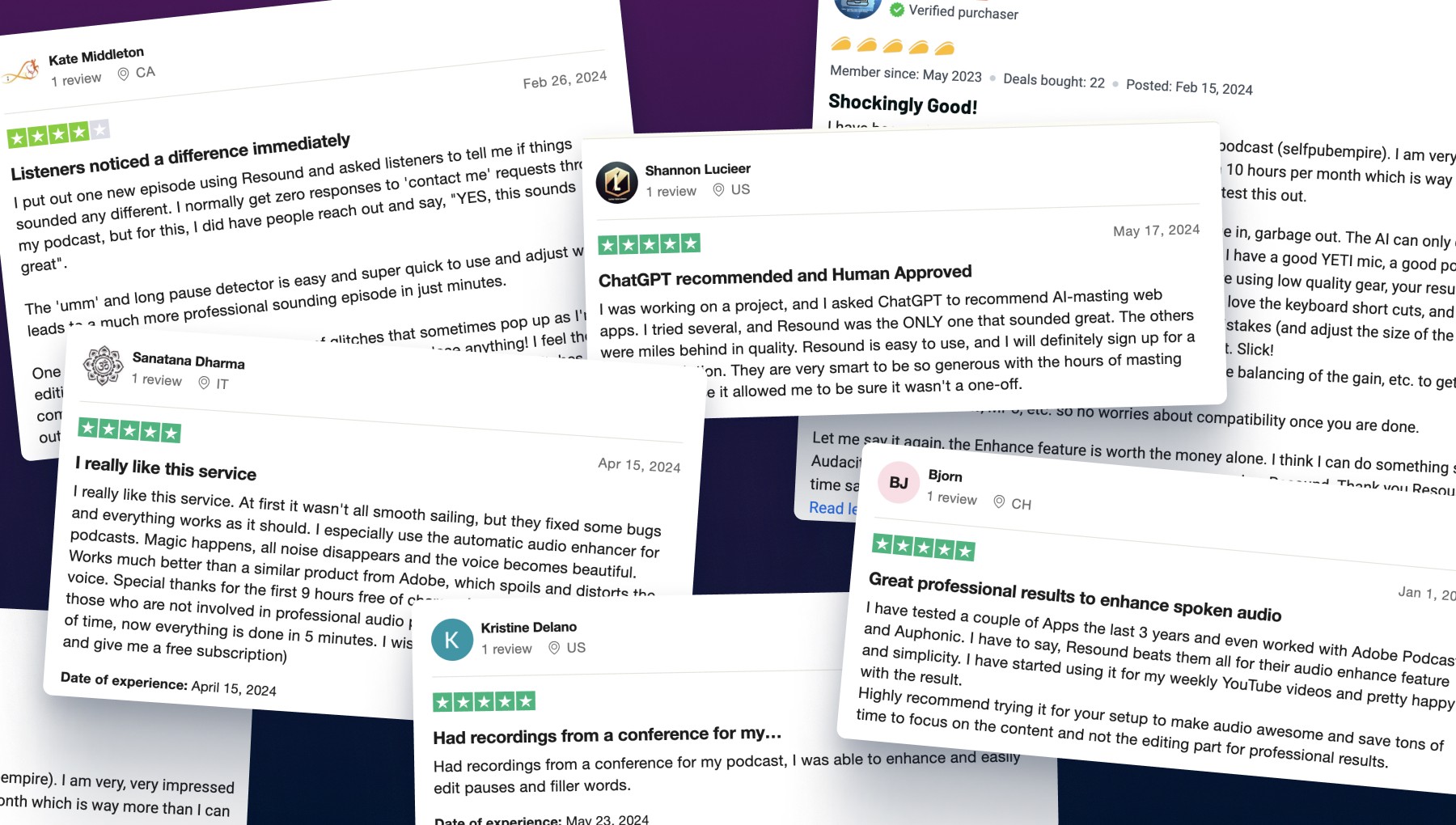
Image of customer reviews

User feedback for our Enhance feature has been incredibly positive since it launched.

Hear the results for yourself.

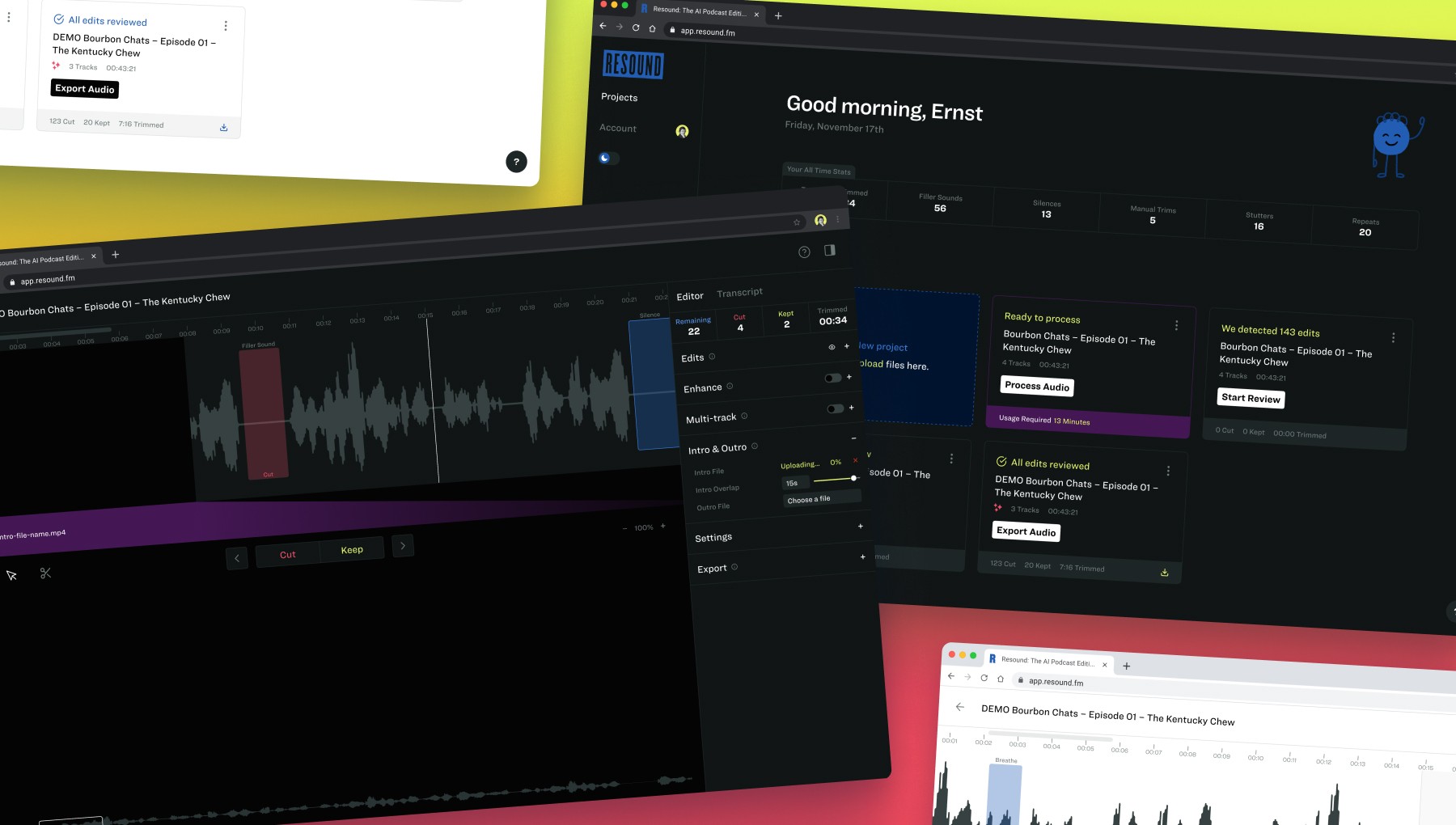
Image of designs to help highlight the user's job-to-be-done

We redesigned the way projects were processed and presented. This provided more transparency to our users and highlighted key next steps to help nudge them along the path to completion.

Image of customer support and education resources on the marketing website

We continued to mature the marketing website and level up our customer support and educational resources.

Image of designs for a full-screen editing experience

We implemented a full-screen editing experience which opened the door for us to design more requested features and workflows.

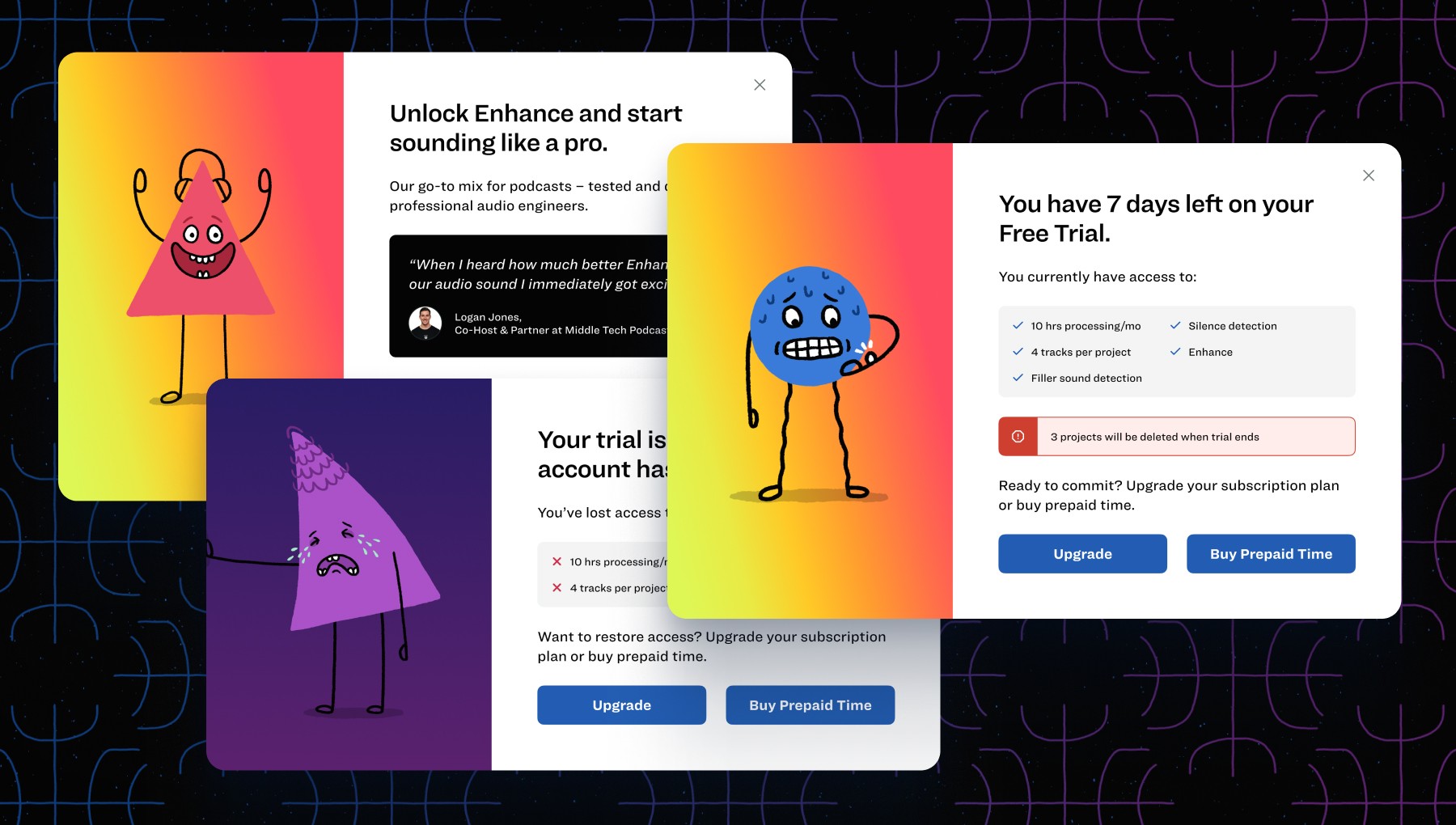
Image of in-app upgrade design for our reverse-free trial model pivot

We switched to a reverse free trial pricing model, offered pre-paid time, and implemented various in-app upgrade calls to action.

Humbling Reality

Saying farewell and feeling thankful for the experience

We were listening to what our users and data said, making good improvements, and moving numbers in the right direction, but the investor market was drying up. Inflation and rising interest rates weren’t working in our favor either. Ultimately, our funding wasn’t able to support myself and others on the team. As tough as those decisions were, I’m proud of what we built and thankful for the new relationships made along the way.

Image of a Chladni character waving good-bye

Conclusion

Growing as a designer and the value of showing up every day

I work full-time as a Product Designer in the financial industry (a job I love). However, all of the work presented in this case study was done outside of my day job – typically in the early morning hours, with an occasional lunch meeting sprinkled in.

I share this because working on Resound has pushed me to grow so much – not only as a designer but as a person. Showing up early each morning has made me more disciplined and confident in the way I approach work. Things I’ve learned while working with the team at Resound have no doubt influenced the work I do at my 9-5, but it goes the other way too.

I believe that one of the best ways to grow professionally and creatively as a designer is to take on side projects like this. The benefits are immeasurable. Not only are you exposed to new and challenging problems to solve, but you also get to see first-hand how other teams approach these problems. It’s a great way to flex the skills you have while getting the reps in to improve your weaknesses. This way of working has made me a stronger designer, both at my full-time job and for freelance clients. Although the Resound chapter has closed, it’s a practice I intend to continue.

If you think there’s an opportunity for me to help you or your team, please get in touch!